
UX Case Study.
Product Overview
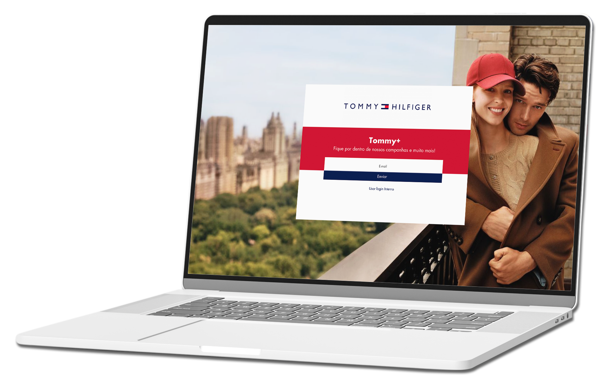
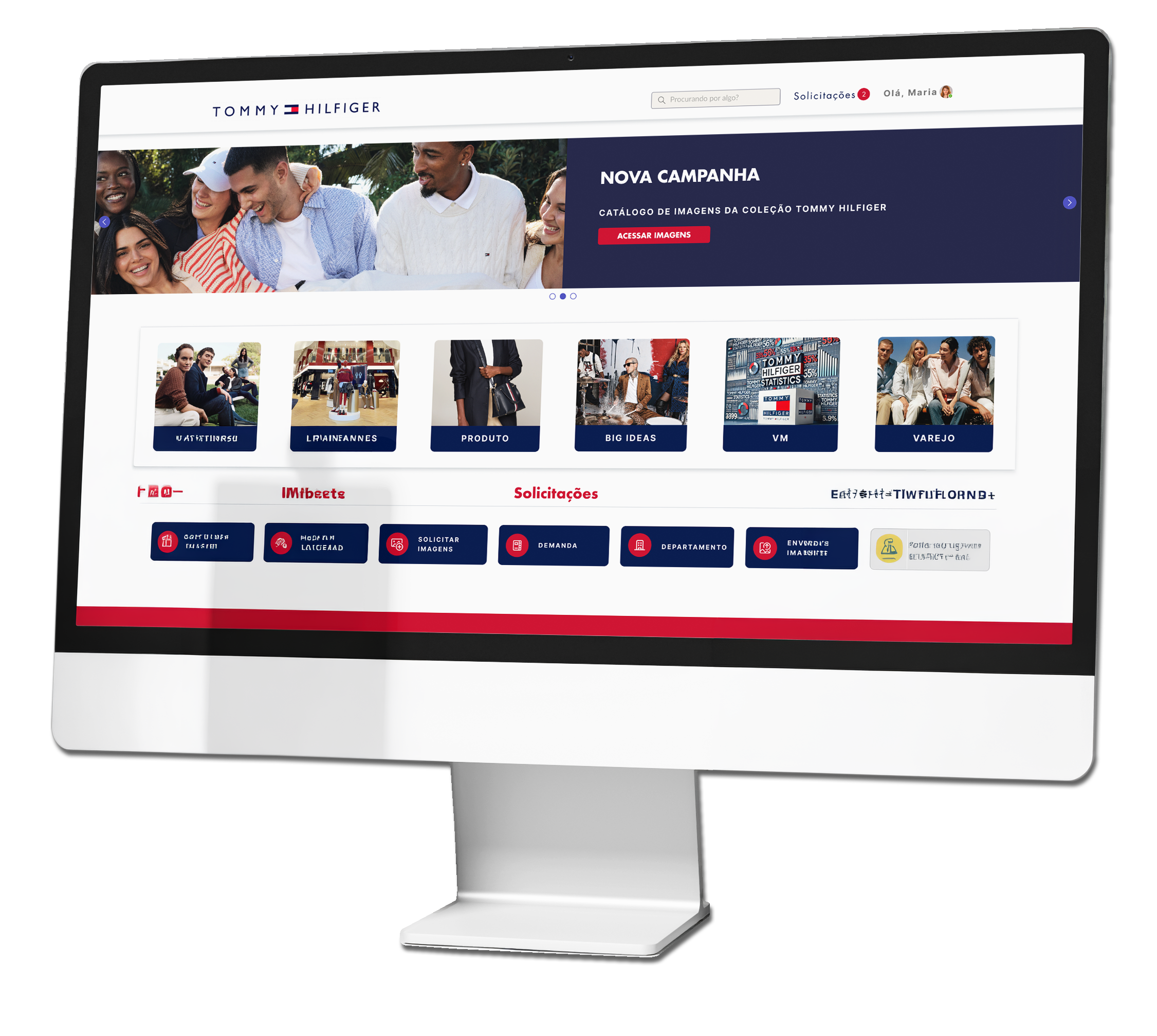
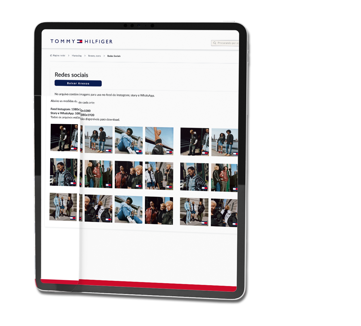
This project aims to evaluate and improve the experience of Tommy Hilfiger's Brazilian logistics team within the ServiceNow portal. The main focus is to map the target audience, understand and meet the needs of the user for using the tools.
Project Duration
5 Weeks
Tools


My Role
As a Product Designer, I make sure that my designs are well received by users, and can be implemented by developers.

UI Documentation
creation of ui documentation so that developers can code well.

Provide Assets
ensure Assets contained in the UI are usable and provide in multiple sizes.

User testing
User testing using UT and AB testing, so that the App can be well received by the user.

UI Audit
Perform UI audits. make sure nothing goes wrong when the App is made.

Flow Documentation
when the application is continued, it can be easily carried out.

Research
This process is made so that the requirements and problems obtained meet the target market.
Design Strategy
A design strategy shows the value your product and services will bring to people and describes this value to a goal. It also describes about the steps you will take to achieve the goal.
Intention
Adjust the design of the platform so that it is easy to use, yet unique to meet the needs of your target audience. Give them the opportunity to have fluidity in their work.
Intention to detail transaction
Vice President in Brazil for Tommy Hilfiger
Target User
- a large number of people, mainly shopkeepers, aged: 30–65 years.
- They use the platform on Desktop and mobile phones.
Tech Constraint
- ServiceNow Limitations
- OS Version Compatibility
- Internet access or network issues
General task
- Coherent brand guide
- Current product catalog
- Current campaigns
- Content refinement
- Reduce friction points
- User satisfaction
Success Factor
- Mobile Platform (IOS/Android)
- Clarity in content
- Fluid navigation
- Decrease in complaints
My Process
Design Thinking Process

Empathize

Define

Ideate

Design

Validation

Empathize
Problem Statement
Although the ServiceNow platform is used worldwide by major brands, it has some issues that end up hindering projects, causing poor user experience and also affecting the tool's reputation. Customer dissatisfaction was identified, given the complaints of many retailers trying to use the tool. Faced with this problem, I began my work to reduce friction points and improve the correlation between customer, tool and supplier.
Objective & Goals
Improve User Evaluation
Adjust the platform according to the user's needs, making the website more user-friendly, with better engagement and high content accuracy.
Reduce Bounce Rates
Reduce bounce rate by 30% in the first week
Develop a Website with Editable Content
Work on the platform so that certain website content is editable for managers.
Desirable Metrics:
Active User
Seldon User
Inactive User
End User
Our target Audience is the Age of 35 - 65 people.
Majority women.








Audience
They live in metropolitan areas and state capitals

Define
Qualitative Research
I conducted an exploratory online research meeting with about 8 users. The study uses surveys to collect qualitative data from users who have used the service.
The research seeks to understand the impact of the service with current tools and content, bounce rates, and overall user experience.
Below I highlight some central questions and the most important points
What are the main challenges you face using the website?
What type of information do you believe is most important?
What features or functionality do you want to see on the website?
During this research phase, I took the opportunity to talk to users from another sector who also use the service.
To do this, I conducted exploratory quantitative research with 3 users from the Returns sector.
This is what I planned for them
How they work:
What is your day-to-day work like? What tools do you use?
How often do you use the portal to process returns?
Identification of Friction Points:
Difficulties and Problems:
- What are the steps in this process?
- What are the main challenges you face when using the portal to process returns?
- Can you describe a recent situation in which you encountered difficulties? What happened?
Needs and Important Information
Needed Information:
- What information do you consider essential to make a return efficient?
- Is there any information that you feel is missing or that could be presented in a clearer way?
Features and Functionality:
- Are there any features or functions that you would like to see in the portal to make your work easier?
- How do you think it could be improved to better meet your needs?
Overall Experience:
How would you describe your overall experience with the Tommy Plus portal in Service Now?
Process Efficiency:
How long, on average, does it take you to complete a return request?
Are there steps in the process that you consider unnecessary or that could be improved?
Needs and Important Information
Needed Information:
- What information do you consider essential to make a return efficient?
- Is there any information that you feel is missing or that could be presented in a clearer way?
Features and Functionality:
- Are there any features or functions that you would like to see in the portal to make your work easier?
- How do you think it could be improved to better meet your needs?
Feedback and Suggestions:
Is there anything I didn't ask about that you would like to share?
Highlights - Target Persona
- Difficulty logging in due to the two available options
- Confusing home page
- Unclear information on pages
- Information repeated on multiple screens
- Broken pages with no direction
- Too many meaningless icons
- Confusing forms with too much information
- Lack of current campaigns
Highlights - Second Persona
- Difficulty in understanding what the Retailer needs.
- Difficulty in talking to the Retailer.
- Difficulty in searching for information on the portal
- Difficulty in helping the Retailer
- Website does not match the brand's visual standard
User Persona

Maria Angélica de Souza
45 years · Store Manager
Background
“I use the portal frequently and, despite really needing the available content, I have faced several difficulties in navigating and using the features, which has negatively impacted my work.”
Main Goal
As a store manager, my main goal is to increase monthly sales by 20% over the next six months by implementing innovative marketing strategies, continuously training staff to improve customer service, and optimizing the store layout to maximize the customer shopping experience.
Technology
IT & Internet
Software
Mobile Apps
Social Networks
Goals
List of others user goals
- Use social media and digital marketing to increase store visibility and engage the local community.
- Establish a recognition and rewards program to encourage excellent customer service.
- Create themed areas and attractive displays that encourage impulse purchases and increase customer dwell time.
Expectations & needs
- Customers expect fast, friendly and efficient service. Staff must be well trained and motivated to meet these expectations.
- Customers expect a clean, organized and inviting store environment. Keeping the store well-organized and visually appealing is essential.
- Customers need high-quality products that meet their needs and expectations. Ensuring a well-managed and up-to-date inventory is essential.
Pain points & objections
List of points of frustration that the user has encountered
- The homepage is disorganized and difficult to navigate, so I can't find the information I need.
- Some pages don't work properly or don't have clear navigation, which is very frustrating.
- The website design doesn't align with the brand's visual identity, which makes me lose trust.
Applications friendly
List of apps he knows and likes


Ideate
Journey Map
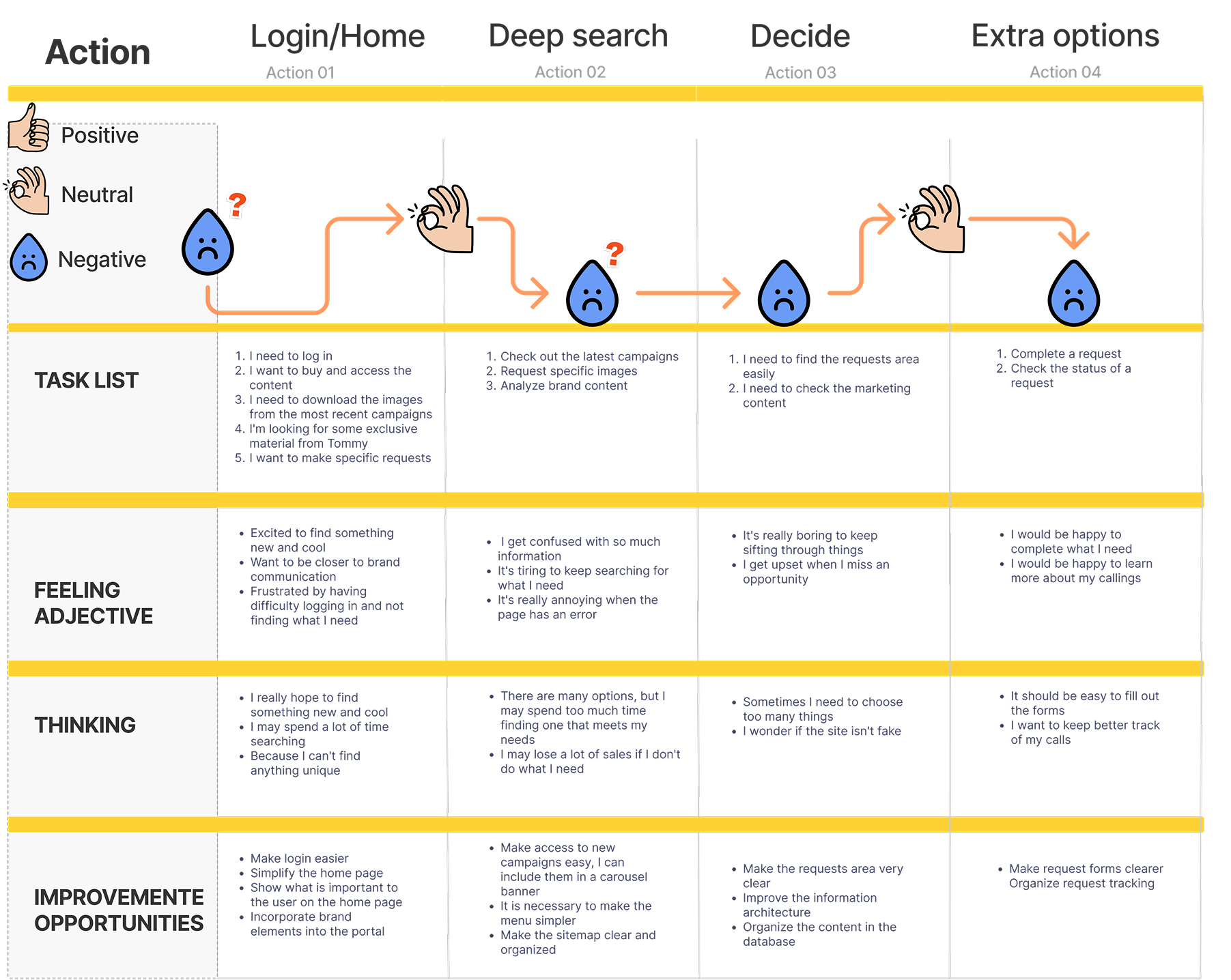
I created a user journey map with the persona on the current website to identify possible problems and opportunities for improvement.
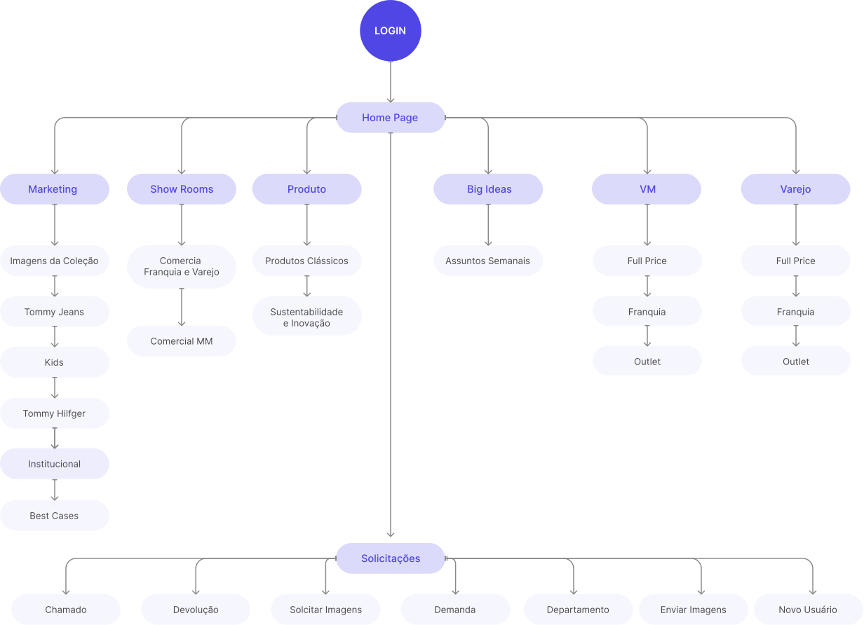
Information architecture
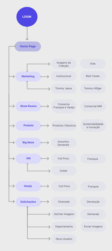
I took the information that users provided in the exploratory interview and combined it with more data from the marketing team, support staff, and stakeholders.
With that, I had a new round of conversations with 5 users to validate the information that was most relevant in a certain order, and then work on the User Flow.
User Flow
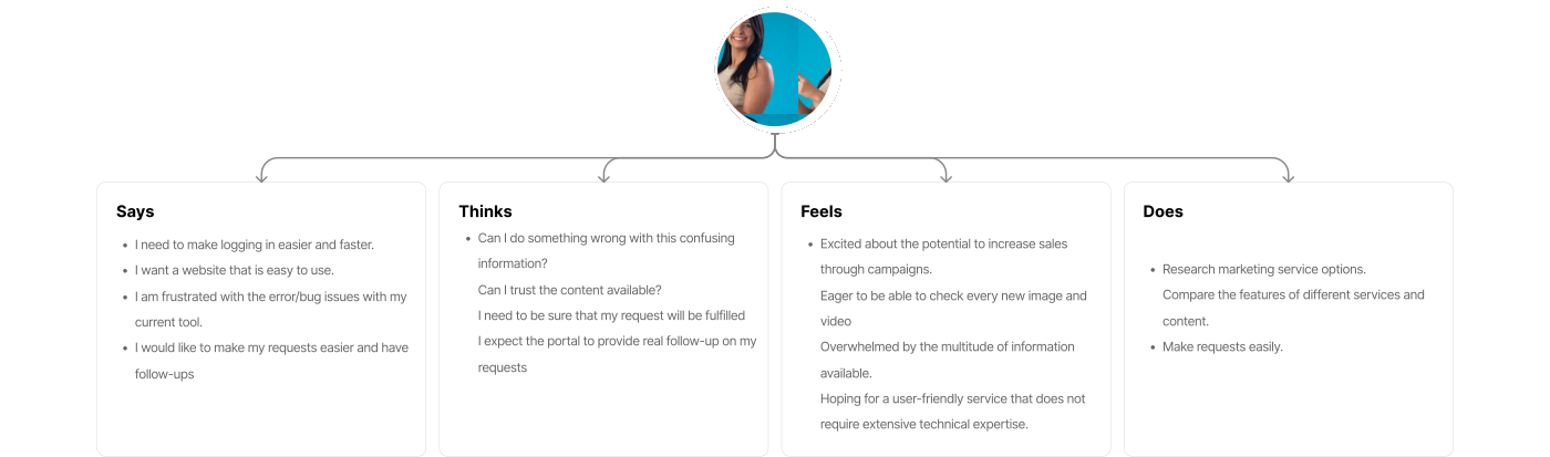
Empathy Map
Says
- I need to make logging in easier and faster.
- I want a website that is easy to use.
- I am frustrated with the error/bug issues with my current tool.
- I would like to make my requests easier and have follow-ups
Thinks
- Can I do something wrong with this confusing information?
- Can I trust the content available?
- I need to be sure that my request will be fulfilled
- I expect the portal to provide real follow-up on my requests
Feels
- Excited about the potential to increase sales through campaigns.
- Eager to be able to check every new image and video
- Overwhelmed by the multitude of information available.
- Hoping for a user-friendly service that does not require extensive technical expertise.
Does
- Research marketing service options.
- Compare the features of different services and content.
- Make requests easily.

Design
Scribbleframes
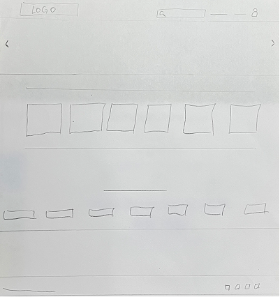
I then created wireframe sketches on paper for each screen of the website, carefully keeping in mind the pain points of users.
The main goal was to meet users' needs by providing a more efficient shopping and learning experience, allowing them to save time and get the most out of each interaction on the website.
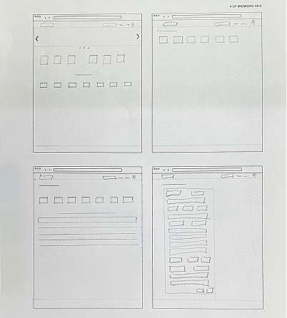
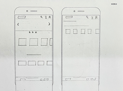
Since website users access the site on a variety of different devices, I started working on designs for different additional screen sizes to ensure the site was fully responsive.
Wireframes
Mid - Fidelity Wireframe
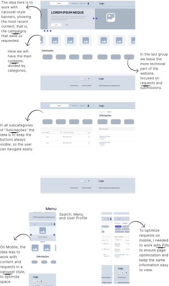
Since our website is on ServiceNow, we have some technical restrictions. Given this, I needed to work closely with the technical team to align understandings and knowledge and keep the customer up to date on everything.
In this scenario, I needed to optimize the components, using the ServiceNow library as a base and I worked on grouping elements so that I could use the standard on several screens.
As a result, the website was lighter, more fluid and drastically reduced processing errors due to many details.

Validation
Usability Study
I conducted two rounds of usability studies. Findings from the first study helped guide designs from wireframes to mockups. The second study used a high-fidelity prototype and revealed which aspects of the models needed refinement.

Primary Research Questions
1. Can users find what they are looking for?
2. Are there difficulties or frustrations in navigating the site?
3. Is the request experience intuitive and satisfying for users?
4. What are the main areas of the site that need improvement to increase user satisfaction?
5. Does the site design encourage users to scan the content in detail?
Key Performance Indicators (KPIs)
1. Time to complete specific tasks (e.g., finding information, making requests).
2. Use of navigation vs. use of search.
3. Rate of user errors during navigation and request.
4. Abandonment rate.
5. Conversion rate (users who complete the purchase).
6. System Usability Scale (SUS).
1st Round of Tests
- • They need login to be easy
- • They want the brand guide to be incorporated
- • They want fluid interactions
At first, people really liked the distribution of content and how each element was arranged. In general, they want to test the prototype in High Fidelity.
2nd Round of Tests
- • They want content fidelity
- • Users prefer more organic elements that express movement
- • Want pages to load faster
When working on the prototype in High Fidelity, users felt relieved and satisfied. It was found that this was due to their needs being met, the quality of the information, ease of use and understanding of the content.
Design
Refinement
To do this, we need to go back to the Design phase to refine the prototype design to meet the requirements.
At this point, given the technical limitations of ServiceNow, we have included what we can from the brandguide and updated the style guide.
Style Guide
Typography
Spacing & Grids
Levels
Grids
Colors
Brand Colors
Text
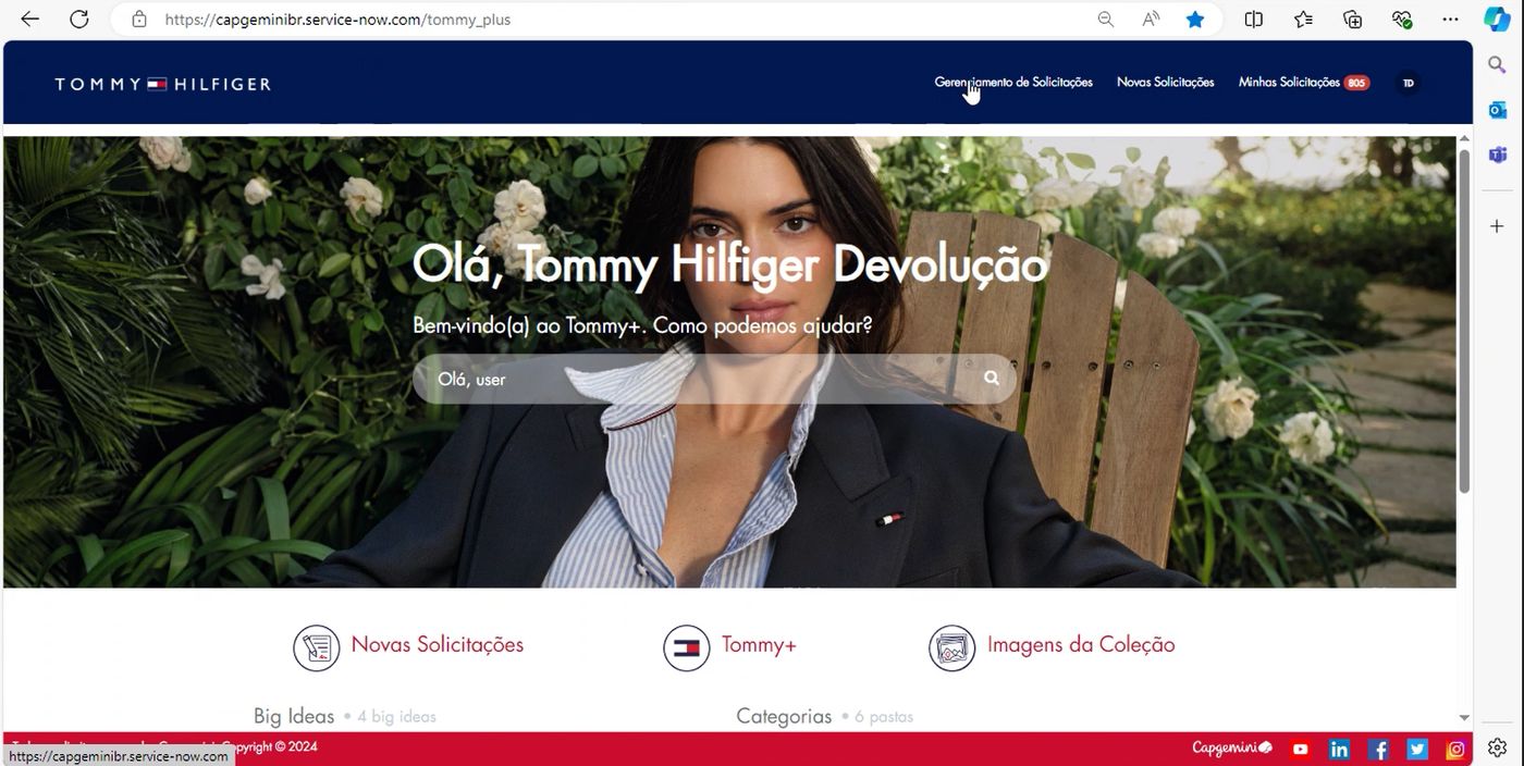
Comparing Design Screens
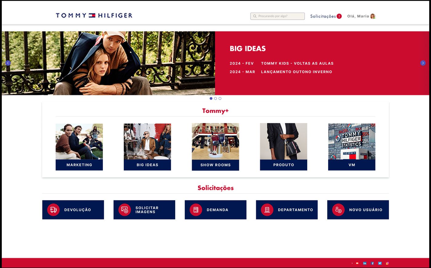
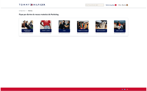
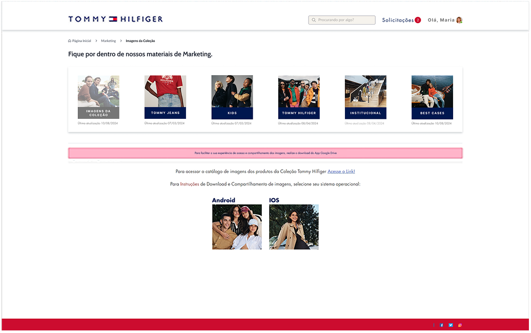
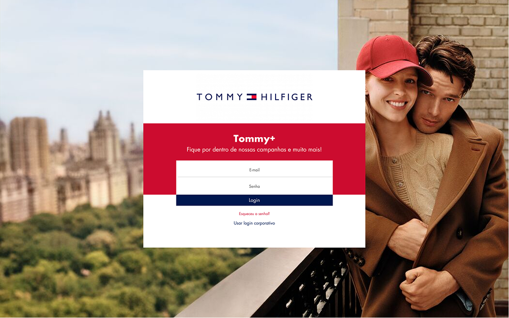
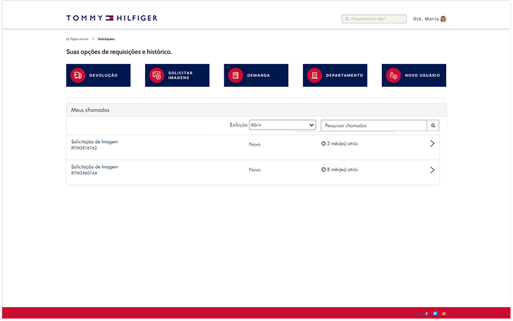
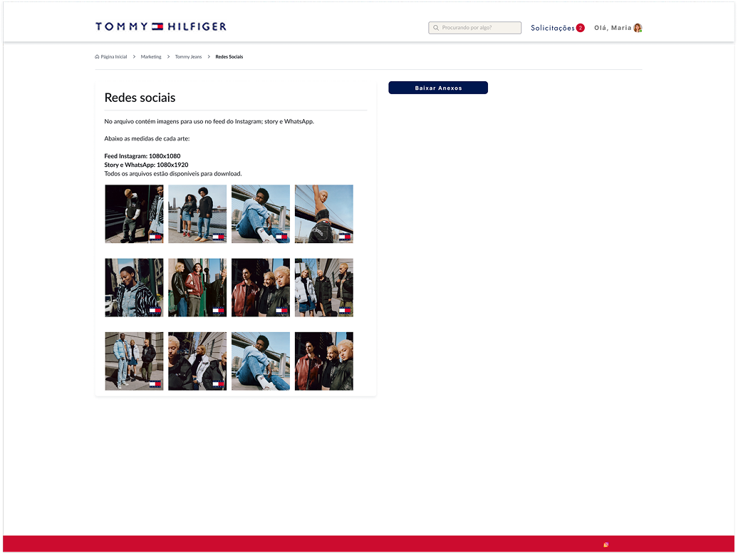
Below, I make it clearer how some screens of the Final Design looked compared to the old Design before starting the project.
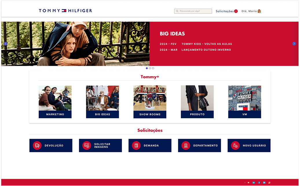
PAGE HOME
the old UI

the new UI

PAGE CONTENT
the old UI
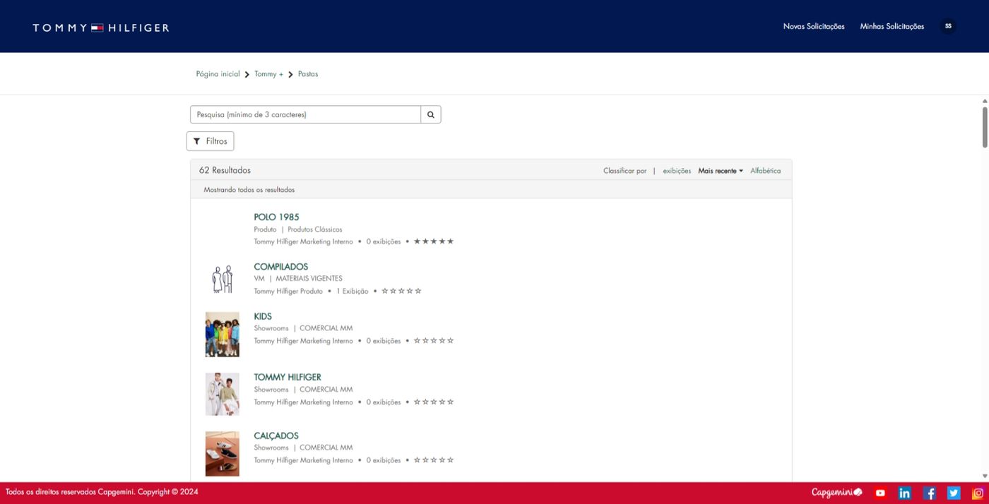
the new UI
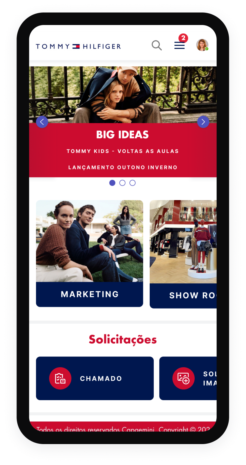
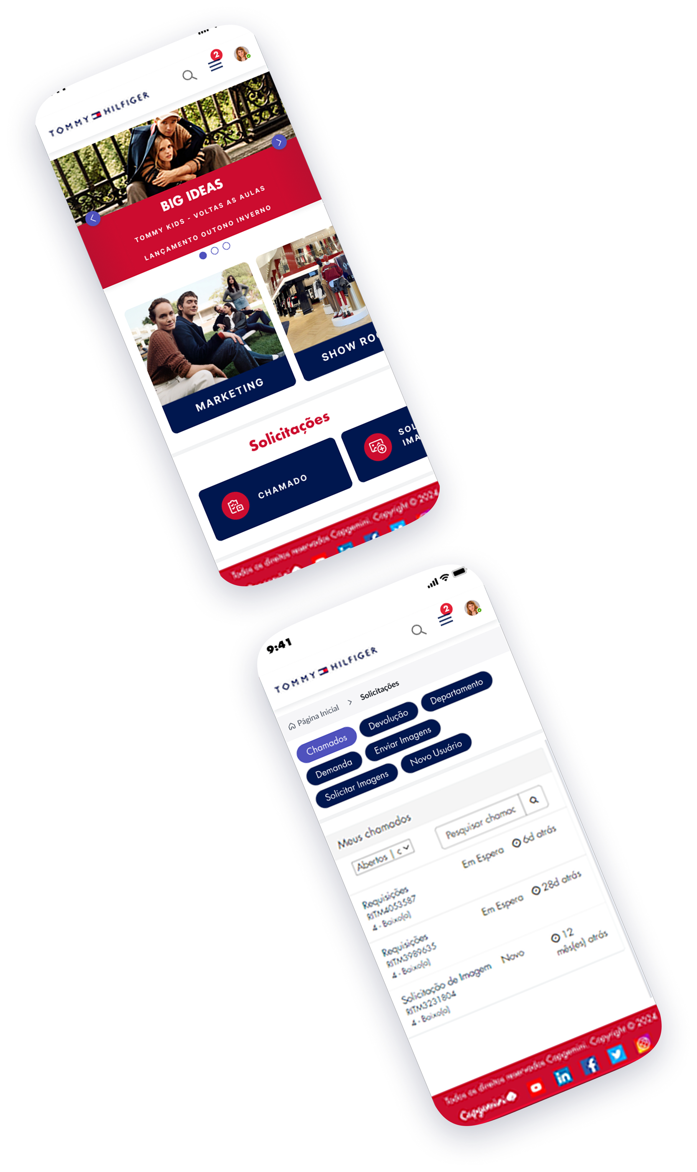
HOME - MOBILE
the old UI
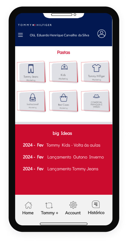
the new UI
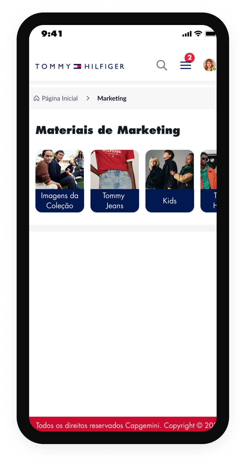
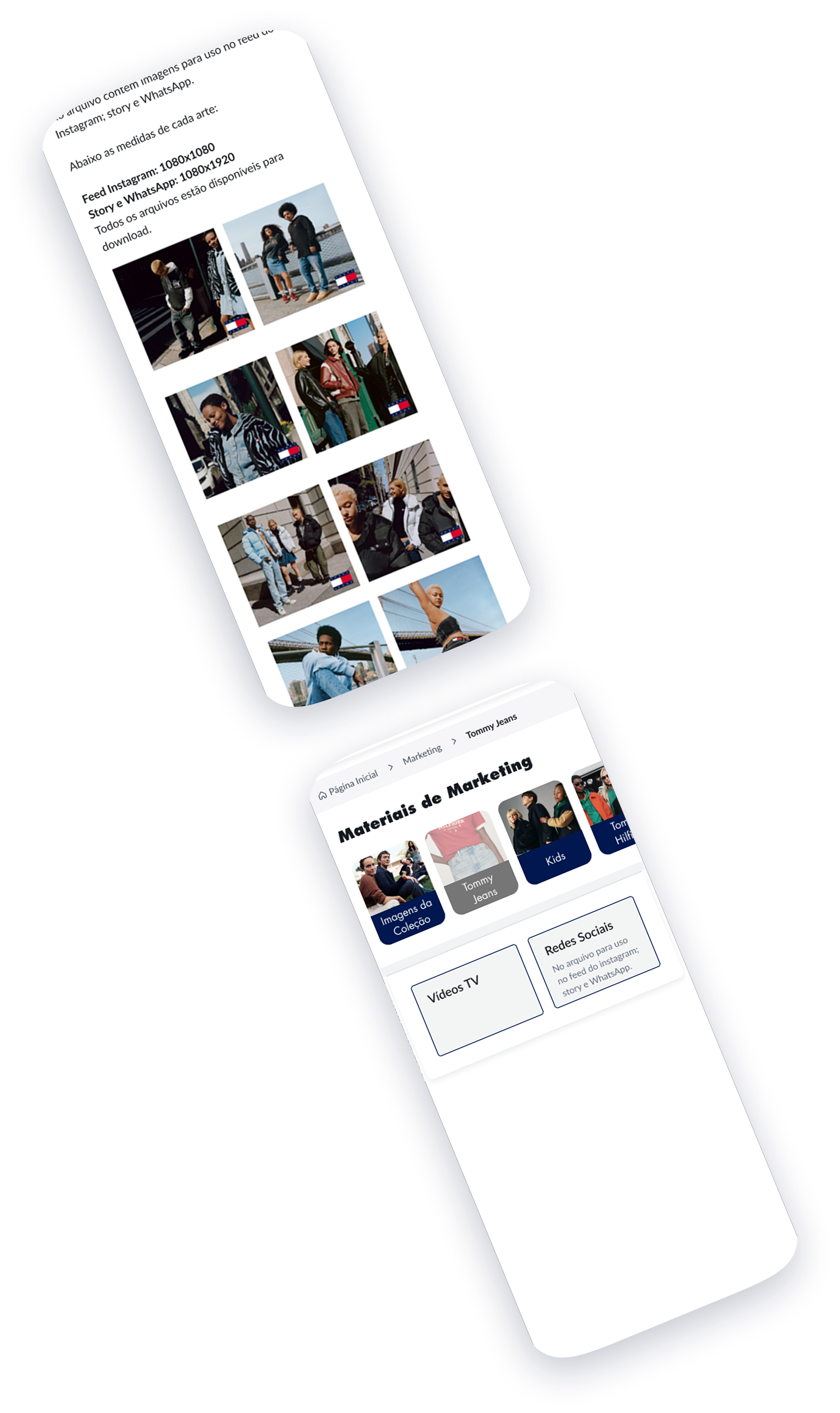
PAGE CONTENT - MOBILE
the old UI
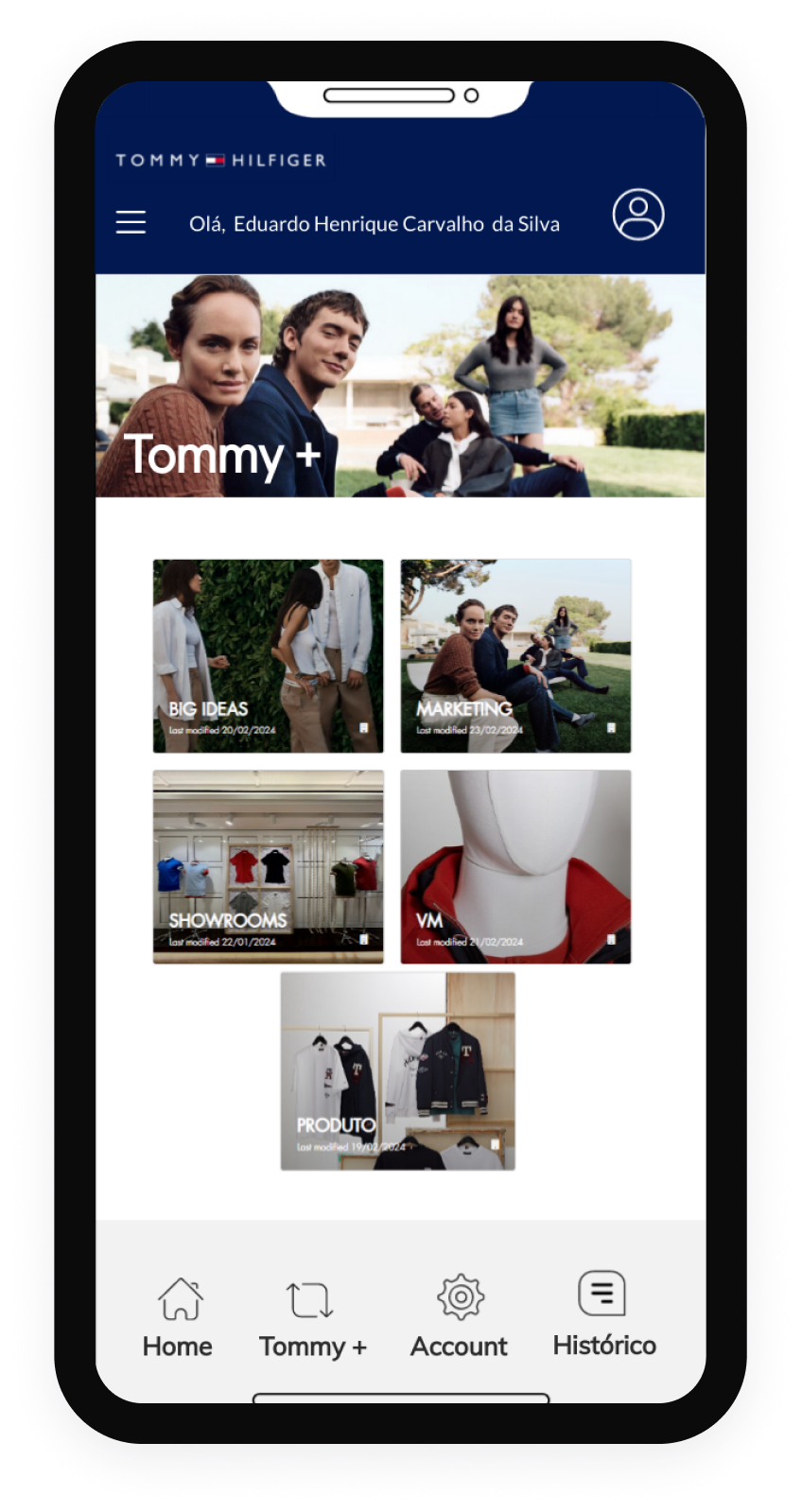
the new UI
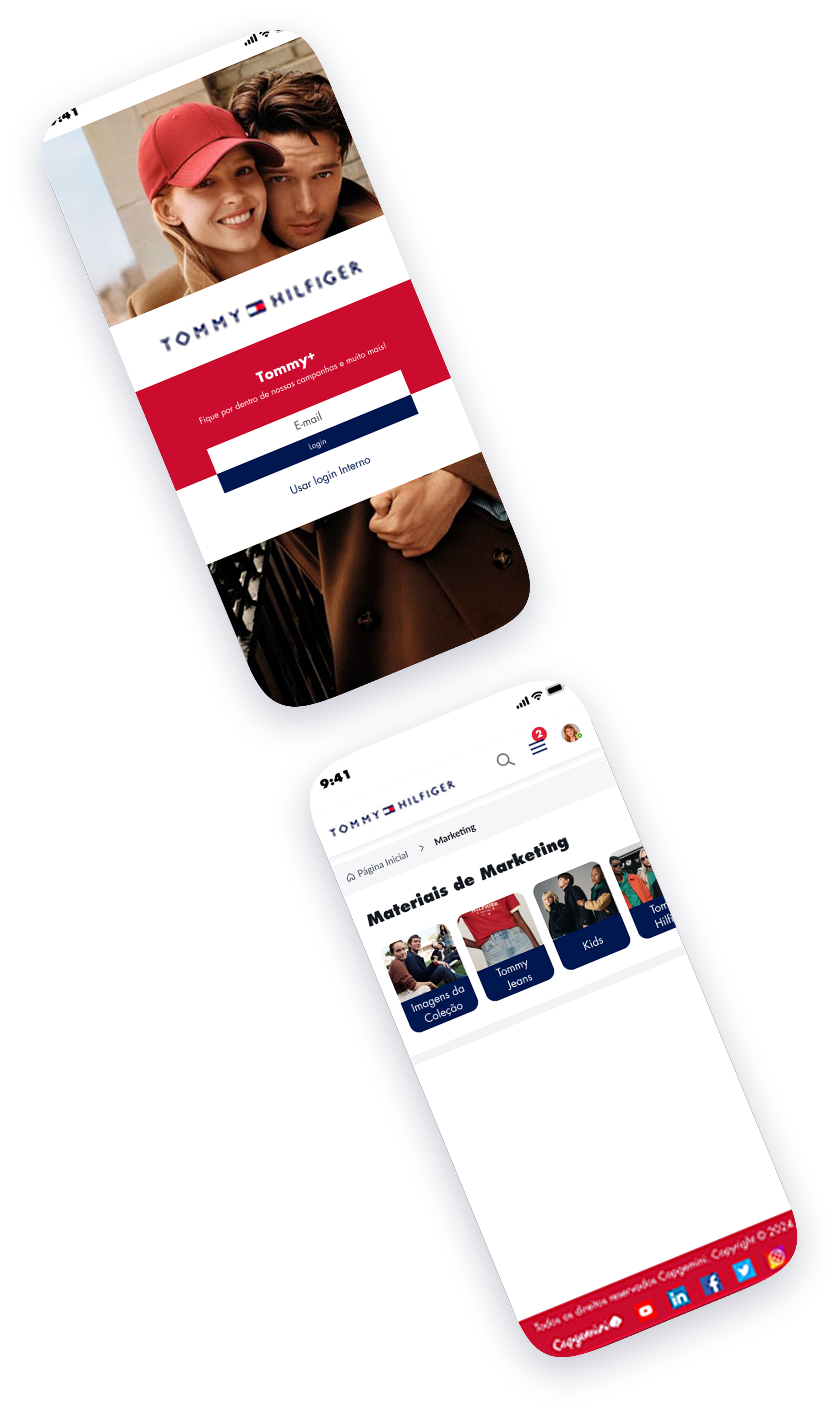
UI Design
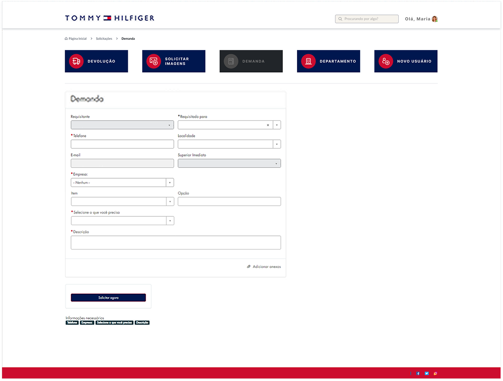
Accessibility Validation
Accessibility validation involves testing the user interface design to ensure that it can be used by people with disabilities, and conforms to accessibility standards such as WCAG (Web Content Accessibility Guidelines). This is important to ensure that the product can be used by a wider range of users, including those with visual, auditory, or motor impairments.
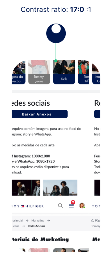
In this sense, I worked on some issues to make the project more accessible.
- I worked on the Contrast Ratio so that we could have a difference between the text color and the background color on a page.
- I used font titles to ensure a clear visual hierarchy.
- I worked on reference points to help the user navigate the site, improving the breadcrumbs for example.
- I included alternative texts on the site to facilitate access for screen readers.
Solutions
Expectation vs Reality
FIX IT SOON
EVERYTHING IS GREAT,
DO NOT TOUCH IT

OPPORTUNITIES
BETTER THAN EXPECTED.
PROMOTE!
Next Steps
We understand that it is essential to plan the next steps to be assertive in the final result.
• Perform a new round of usability testing after adjustments
• Upload the test version to the platforms
• Development and evolution of the Design System
Development and application of the Desktop and Mobile version
Conclusion
The new website is aligned with what users needed.
During the project, we realized that it was necessary to include some additional content that was requested by project stakeholders, and we also included some additional resources that users highlighted. These were widely publicized internally and received positive feedback from users.

Sidney da Silva
UX Case Study.
Product Overview
This project aims to evaluate and improve the experience of Tommy Hilfiger's Brazilian logistics team within the ServiceNow portal. The main focus is to map the target audience, understand and meet the needs of the user for using the tools.
Project Duration
5 Weeks
Tools
My Role
As a Product Designer, I make sure that my designs are well received by users, and can be implemented by developers.
UI Documentation
creation of ui documentation so that developers can code well.
Provide Assets
ensure Assets contained in the UI are usable and provide in multiple sizes.
User testing
User testing using UT and AB testing, so that the App can be well received by the user.
UI Audit
Perform UI audits. make sure nothing goes wrong when the App is made.
Flow Documentation
when the application is continued, it can be easily carried out.
Research
This process is made so that the requirements and problems obtained meet the target market.
Intention
Adjust the design of the platform so that it is easy to use, yet unique to meet the needs of your target audience. Give them the opportunity to have fluidity in their work.
Intention to detail transaction
VP in Brazil for Tommy Hilfiger
Target User
- a large number of people, mainly shopkeepers, aged: 30–65 years.
- They use the platform on Desktop and mobile phones.
Tech Constraint
- ServiceNow Limitations
- OS Version Compatibility
- Internet access or network issues
Design Strategy
A design strategy shows the value your product and services will bring to people and describes this value to a goal. It also describes about the steps you will take to achieve the goal.
General task
- Coherent brand guide
- Current product catalog
- Current campaigns
- Content refinement
- Reduce friction points
- User satisfaction
Success Factor
- Mobile Platform (IOS/Android)
- Clarity in content
- Fluid navigation
- Decrease in complaints
My Process
Design Thinking Process
Empathize
Define
Ideate
Design
Validation
Empathize
Problem Statement
Although the ServiceNow platform is used worldwide by major brands, it has some issues that end up hindering projects, causing poor user experience and also affecting the tool's reputation. Customer dissatisfaction was identified, given the complaints of many retailers trying to use the tool. Faced with this problem, I began my work to reduce friction points and improve the correlation between customer, tool and supplier.
Objective & Goals
Improve User Evaluation
Adjust the platform according to the user's needs, making the website more user-friendly, with better engagement and high content accuracy.
Reduce Bounce Rates
Reduce bounce rate by 30% in the first week
Develop a Website with Editable Content
Work on the platform so that certain website content is editable for managers.
Desirable Metrics:
Active User
Seldon User
Inactive User
End User
Our target Audience is the Age of 35 - 65 people.
Majority women.
Audience
They live in metropolitan areas and state capitals
Define
Qualitative Research
I conducted an exploratory online research meeting with about 8 users. The study uses surveys to collect qualitative data from users who have used the service.
The research seeks to understand the impact of the service with current tools and content, bounce rates, and overall user experience.
Below I highlight some central questions and the most important points
What are the main challenges you face using the website?
What type of information do you believe is most important?
What features or functionality do you want to see on the website?
During this research phase, I took the opportunity to talk to users from another sector who also use the service.
To do this, I conducted exploratory quantitative research with 3 users from the Returns sector.
This is what I planned for them
How they work:
What is your day-to-day work like? What tools do you use?
How often do you use the portal to process returns?
Identification of Friction Points:
Difficulties and Problems:
What are the steps in this process?
What are the main challenges you face when using the portal to process returns?
Can you describe a recent situation in which you encountered difficulties? What happened?
Needs and Important Information
Needed Information:
What information do you consider essential to make a return efficient?
Is there any information that you feel is missing or that could be presented in a clearer way?
Features and Functionality:
Are there any features or functions that you would like to see in the portal to make your work easier?
How do you think it could be improved to better meet your needs?
Overall Experience:
How would you describe your overall experience with the Tommy Plus portal in Service Now?
Process Efficiency:
How long, on average, does it take you to complete a return request?
Are there steps in the process that you consider unnecessary or that could be improved?
Needs and Important Information
Needed Information:
What information do you consider essential to make a return efficient?
Is there any information that you feel is missing or that could be presented in a clearer way?
Features and Functionality:
Are there any features or functions that you would like to see in the portal to make your work easier?
How do you think it could be improved to better meet your needs?
Feedback and Suggestions:
Is there anything I didn't ask about that you would like to share?
Highlights - Target Persona
- Difficulty logging in due to the two available options
- Confusing home page
- Unclear information on pages
- Information repeated on multiple screens
- Broken pages with no direction
- Too many meaningless icons
- Confusing forms with too much information
- Lack of current campaigns
Highlights - Second Persona
- Difficulty in understanding what the Retailer needs.
- Difficulty in talking to the Retailer.
- Difficulty in searching for information on the portal
- Difficulty in helping the Retailer
- Website does not match the brand's visual standard
User Persona
Maria Angélica de Souza
45 years · Store Manager
Background
“I use the portal frequently and, despite really needing the available content, I have faced several difficulties in navigating and using the features, which has negatively impacted my work.”
Main Goal
As a store manager, my main goal is to increase monthly sales by 20% over the next six months by implementing innovative marketing strategies, continuously training staff to improve customer service, and optimizing the store layout to maximize the customer shopping experience.
Technology
IT & Internet
Software
Mobile Apps
Social Networks
Goals
List of others user goals
- Use social media and digital marketing to increase store visibility and engage the local community.
- Establish a recognition and rewards program to encourage excellent customer service.
- Create themed areas and attractive displays that encourage impulse purchases and increase customer dwell time.
Expectations & needs
- Customers expect fast, friendly and efficient service. Staff must be well trained and motivated to meet these expectations.
- Customers expect a clean, organized and inviting store environment. Keeping the store well-organized and visually appealing is essential.
- Customers need high-quality products that meet their needs and expectations. Ensuring a well-managed and up-to-date inventory is essential.
Pain points & objections
List of points of frustration that the user has encountered
- The homepage is disorganized and difficult to navigate, so I can't find the information I need.
- Some pages don't work properly or don't have clear navigation, which is very frustrating.
- The website design doesn't align with the brand's visual identity, which makes me lose trust.
Applications friendly
List of apps he knows and likes
Ideate
Journey Map
I created a user journey map with the persona on the current website to identify possible problems and opportunities for improvement.
Information architecture
I took the information that users provided in the exploratory interview and combined it with more data from the marketing team, support staff, and stakeholders.
With that, I had a new round of conversations with 5 users to validate the information that was most relevant in a certain order, and then work on the User Flow.
User Flow
Empathy Map
Design
Scribbleframes
I then created wireframe sketches on paper for each screen of the website, carefully keeping in mind the pain points of users.
The main goal was to meet users' needs by providing a more efficient shopping and learning experience, allowing them to save time and get the most out of each interaction on the website.
Since website users access the site on a variety of different devices, I started working on designs for different additional screen sizes to ensure the site was fully responsive.
Wireframes
Mid - Fidelity Wireframe
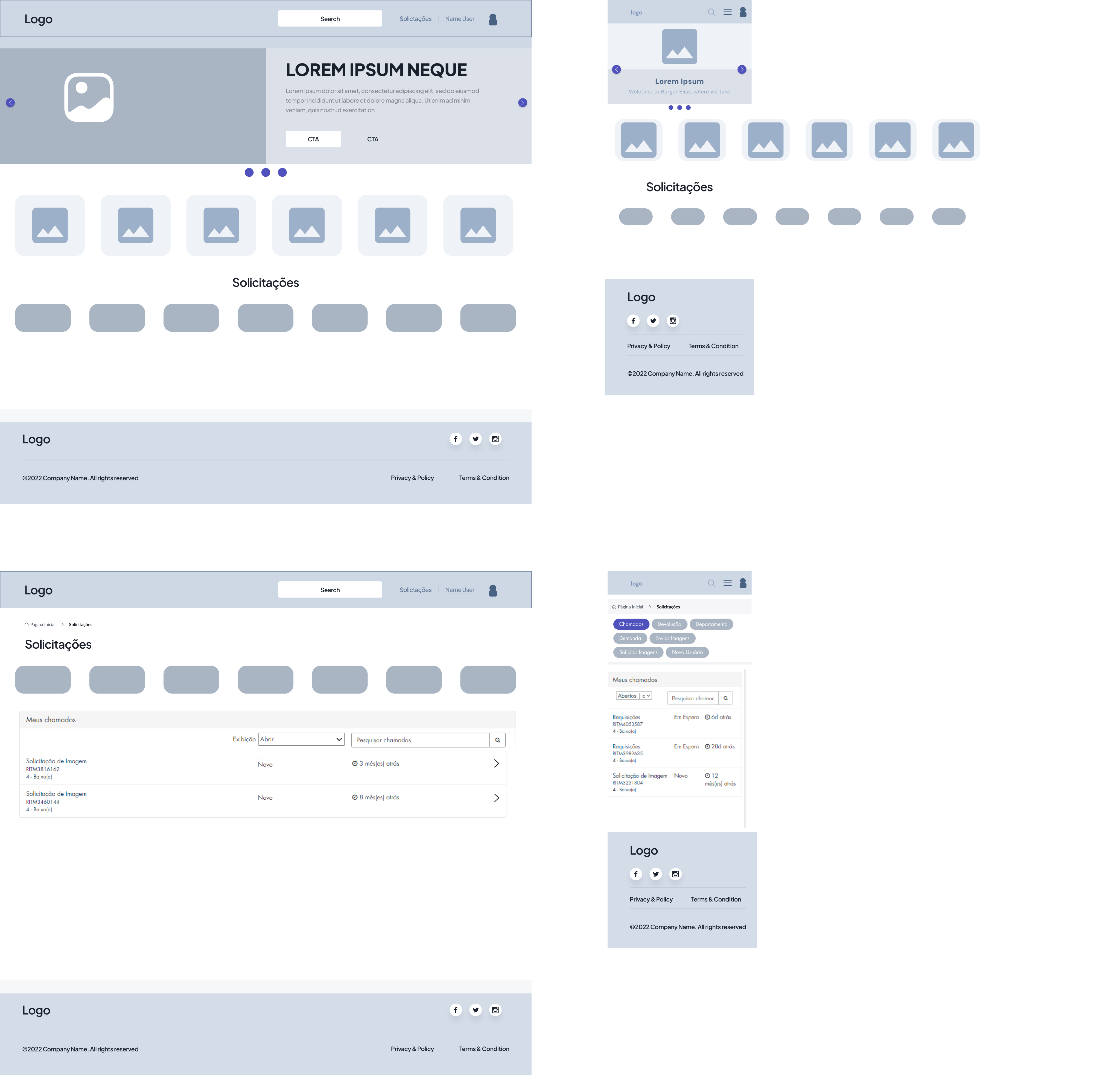

The idea here is to
work with carousel-
style banners, showing
the most recent
content, that is, the
campaigns that were
so requested.
Here we will have the
main contents, divided
by categories.
In the last group we
leave the more
technical part of the
website, focused on
requests and
submissions.
In all subcategories of
“Solicitações” the idea
is to keep the buttons
always visible, so the
user can navigate
easily.
Menu
Search, Menu and
User Profile
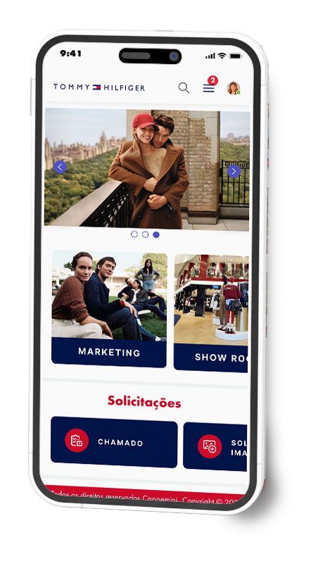
On Mobile, the idea
was to work with
content and requests
in a carousel style, to
optimize space.
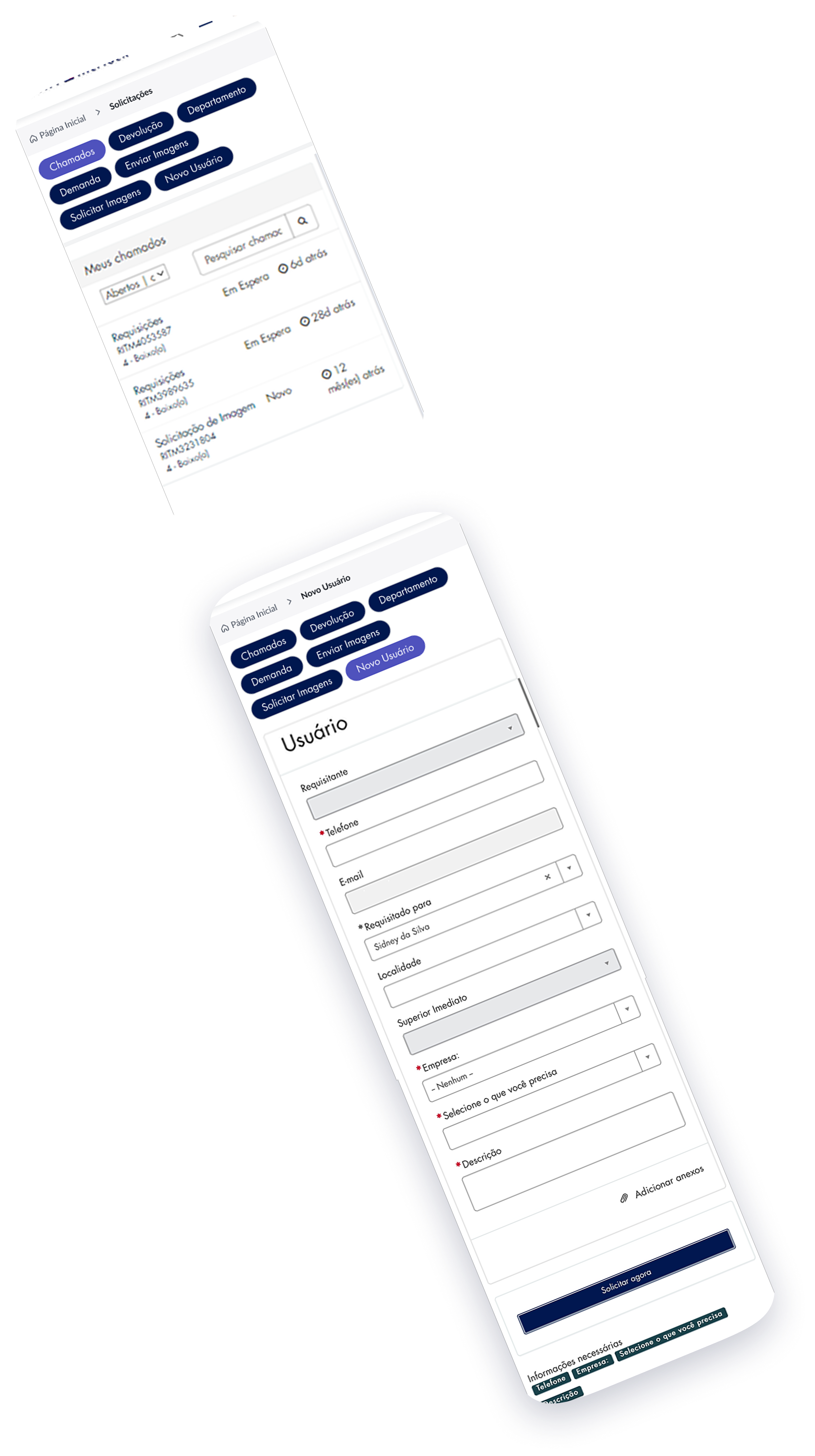
To optimize requests
on mobile, I needed to
work with Pills to
ensure page
optimization and keep
the same information
easy to view.
Since our website is on ServiceNow, we have some technical restrictions. Given this, I needed to work closely with the technical team to align understandings and knowledge and keep the customer up to date on everything.
In this scenario, I needed to optimize the components, using the ServiceNow library as a base and I worked on grouping elements so that I could use the standard on several screens.
As a result, the website was lighter, more fluid and drastically reduced processing errors due to many details.
Validation
Usability Study
I conducted two rounds of usability studies. Findings from the first study helped guide designs from wireframes to mockups. The second study used a high-fidelity prototype and revealed which aspects of the models needed refinement.
Primary Research Questions
1. Can users find what they are looking for?
2. Are there difficulties or frustrations in navigating the site?
3. Is the request experience intuitive and satisfying for users?
4. What are the main areas of the site that need improvement to increase user satisfaction?
5. Does the site design encourage users to scan the content in detail?
Key Performance Indicators (KPIs)
1. Time to complete specific tasks (e.g., finding information, making requests).
2. Use of navigation vs. use of search.
3. Rate of user errors during navigation and request.
4. Abandonment rate.
5. Conversion rate (users who complete the purchase).
6. System Usability Scale (SUS).
1st Round of Tests
● They need login to be easy
● They want the brand guide to be incorporated
● They want fluid interactions
At first, people really liked the distribution of content and how each element was arranged. In general, they want to test the prototype in High Fidelity.
2nd Round of Tests
● They want content fidelity
● Users prefer more organic elements that express movement
● Want pages to load faster
When working on the prototype in High Fidelity, users felt relieved and satisfied. It was found that this was due to their needs being met, the quality of the information, ease of use and understanding of the content.
Design
Refinement
To do this, we need to go back to the Design phase to refine the prototype design to meet the requirements.
At this point, given the technical limitations of ServiceNow, we have included what we can from the brandguide and updated the style guide.
Style Guide
Typography
Spacing & Grids
Levels
Grids
Colors
Brand Colors
Text
Comparing Design Screens
Below, I make it clearer how some screens of the Final Design looked compared to the old Design before starting the project.
PAGE HOME
the old UI
the new UI
PAGE CONTENT
the old UI
the new UI
HOME - MOBILE
the old UI
the new UI
PAGE CONTENT - MOBILE
the old UI
the new UI
UI Design
Accessibility Validation
Accessibility validation involves testing the user interface design to ensure that it can be used by people with disabilities, and conforms to accessibility standards such as WCAG (Web Content Accessibility Guidelines). This is important to ensure that the product can be used by a wider range of users, including those with visual, auditory, or motor impairments.
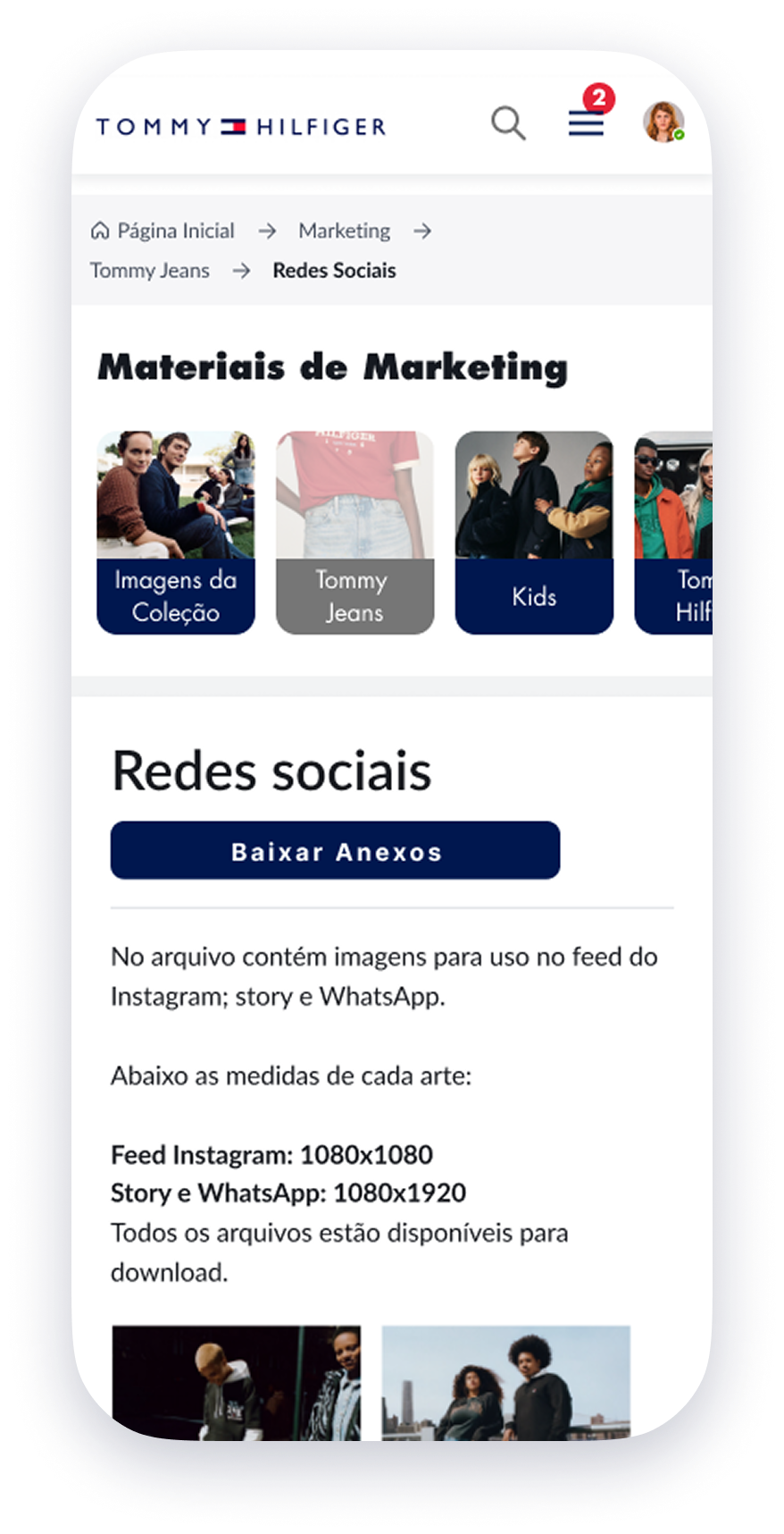

Contrast ratio: 17:0 :1
In this sense, I worked on some issues to make the project more accessible.
- I worked on the Contrast Ratio so that we could have a difference between the text color and the background color on a page.
- I used font titles to ensure a clear visual hierarchy.
- I worked on reference points to help the user navigate the site, improving the breadcrumbs for example.
- I included alternative texts on the site to facilitate access for screen readers.
Solutions
Expectation vs Reality
FIX IT SOON
EVERYTHING IS GREAT,
DO NOT TOUCH IT
OPPORTUNITIES
BETTER THAN EXPECTED.
PROMOTE!
Next Steps
We understand that it is essential to plan the next steps to be assertive in the final result.
• Perform a new round of usability testing after adjustments
• Upload the test version to the platforms
• Development and evolution of the Design System
Development and application of the Desktop and Mobile version
Conclusion
The new website is aligned with what users needed.
During the project, we realized that it was necessary to include some additional content that was requested by project stakeholders, and we also included some additional resources that users highlighted. These were widely publicized internally and received positive feedback from users.
Sidney da Silva